A newer version of this document is available. Customers should click here to go to the newest version.
Window: Platform Power Analysis
Use the Platform Power Analysis viewpoint to review, visualize, and interpret power and energy data collected using Intel® SoC Watch.
Energy analysis data collected by Intel SoC Watch version 2.3 or later on an Android* or Linux* device can be imported into Intel® VTune™ Profiler and visualized with the Platform Power Analysis viewpoint. The Summary window is always present, but other windows within the viewpoint will vary depending on the metrics collected with Intel SoC Watch. For example, the ddr-bw metrics are visualized on the DDR Bandwidth window. The metrics available to you will depend on your device hardware and operating system. Review the Intel SoC Watch User's Guide for your operating system for detailed information on each metric.
Collection and Visualization Method
Energy data is collected and visualized using the following mechanisms:
Sampled Value Data: The value is gathered by sampling energy data over regular or irregular intervals. There can either be a set range of values (as with North Complex D0ix States) or the actual value can be measured at the sampling point (as with Thermal temperature). The values between sampling points are not known. The values are visualized with sampling points in the timeline pane.
For example, North Complex D0ix State values are sampled over regular intervals. At every sample point, a D-State value is returned at the time the sample was taken and is visualized with a set color in the timeline pane.

Sampled Residency Data: The value is gathered by sampling data over regular intervals. There is a set range of values. The exact time of transition between values is not known, but the percentage of time spent in each value is calculated and displayed as a heat map in the timeline pane.
For example, the Graphics C-State status is collected at regular intervals. The value transitioned in and out of different C-States during the collection time, but the exact transition time is not tracked. Instead, a heat map shows that more time was spent in one state than the other. Hover over the graph to see the exact percentage of time spent in each state.

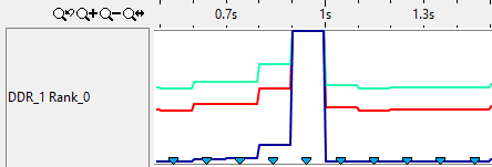
Sampled Counter Data: The value is gathered by measuring a count since the previous sampling point. The data is then calculated into a rate per second to show the changes over time and visualized as a line graph in the timeline pane.
For example, the DDR Bandwidth data is displayed as a line graph with different lines for read, write, read partials, and write partials. Sampling points show when the counts were collected.

Traced Residency Data: The value is gathered when the state changes from one value to another. The time spent in the previous state is known and can be displayed in the timeline pane. In some cases an additional metric is tracked, such as the frequency values for the Core P-State Residency metric.
For example, for the Core-C-State Residency Metric, a processor is in a certain C-State at any given time. C0 is the active state and Cn is a sleep state where a larger number means a deeper sleep state. When the processor transitions from one C-State to another, an event is emitted and the transition and time spent in the previous state is logged. The values are visualized as colored bars indicating the time in a certain state in the timeline pane. Drag and select an area of the timeline and then select the Zoom In on Selection option from the menu that appears to show finer granularity in the timeline pane. For more information, see Managing Timeline View.

Traced Event Data: The value is gathered when a new event occurs. Each event is displayed on the timeline with an event marker showing the exact time that the event occurred. Events of the same type are shown with the same color marker. The legend to the right of the timeline shows what color marker corresponds to each event type collected.
Unlike other traced event data, Wakeup and Abort events are displayed as bars and triangle event points on the timeline pane. Each event is color-coded by event type (timer, scheduled, etc.). The bar length shows how the event corresponds with the CPU sleep state, even though the event is instantaneous. The exact time of the wakeup or abort event is shown with the triangle.
