A newer version of this document is available. Customers should click here to go to the newest version.
Window: Graphics C/P States - Platform Power Analysis
To access this window: Select the Platform Power Analysis viewpoint and click the Graphics C/P States sub-tab in the result tab.
Use the Graphics C/P States window to:
- Review the GPU sleep states (C-state) and processor frequency (P-state) by device.
- Analyze GPU sleep states and processor frequency changes over time.
- Identify which device spent time at a particular frequency.
- View which devices were active at a specific time.
Platform Power Analysis viewpoint is available as part of energy analysis. Collecting energy analysis with Intel® SoC Watch is available for target Android*, Windows*, or Linux* devices. Import and viewing of the Intel SoC Watch results is supported with any version of the VTune Profiler.
Graphics C/P States Pane

Shows the time spent in each state or frequency, organized by device. Click the expand![]() /collapse
/collapse![]() buttons in the data columns to expand the column and show data for different C-States and P-States in each device. You can change the unit displayed by right-clicking a data cell and selecting the Show Data As option to select an alternate unit. For example, select Show Data As > Time and Bar to view a visual representation of the percent of collection time spent in each state.
buttons in the data columns to expand the column and show data for different C-States and P-States in each device. You can change the unit displayed by right-clicking a data cell and selecting the Show Data As option to select an alternate unit. For example, select Show Data As > Time and Bar to view a visual representation of the percent of collection time spent in each state.

Timeline Pane
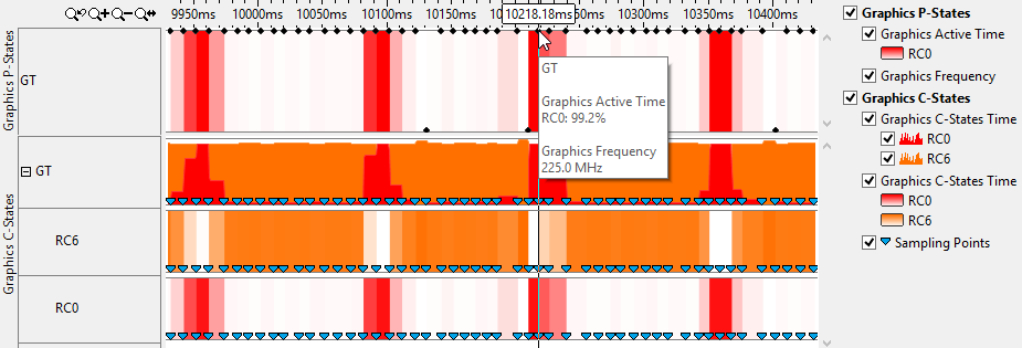
Displays the C-states and P-states of each device at each point in time. The states are shown in a different color as identified by the legend to the right of the timeline. The frequency graph uses data points to indicate that the data has been read from the hardware at discrete sampling points instead of from a residency counter. Hover over a blue marker to see the time when the sampling point occurred.

Time spent in each state is represented by a heat map. The heat map data may not be visible when viewing the full timeline. Zoom in on a section of interest to view the heat map and details about the data points. The heat map, represented in the example below with shades of red in the Graphics P-States timeline, illustrates how active the device was since the previous sample. The deeper the red color, the longer it was in the active state. The exact transitions between active and idle are not known. Hover over a point to view the percentage of time in the active state. In the example below, the device was active for 99.2% of the time between the two sampling points and the color is the deepest shade of red. The bars with lighter shades indicate less time in the active state.

Use the timeline to identify times when there was a higher frequency for a longer period of time and ensure that it matches expectations. If it does not, you can look at the CPU C/P States tab to show CPU activity at the same time. You can also view the Bandwidth tab to see if a similar spike in activity occurs in that tab. Filters applied on a timeline in one window are applied on all other windows within the viewpoint. This is useful if you identify an issue on one tab and want to see how the issue impacts the metrics shown on a different tab.