Visible to Intel only — GUID: vwh1692318346194
Ixiasoft
Visible to Intel only — GUID: vwh1692318346194
Ixiasoft
1.17. Using the Node Finder
To launch the Node Finder, on the Quartus® Prime software menu, click View > Node Finder.
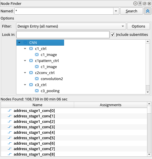
The Named field serves as the starting point for initiating a search. The Node Finder accepts partial or full-text characters and standard wildcard characters (" * " and " ? "). When you click Search, the Node Finder searches all node names matching the text you specify. Node Finder saves your search strings. Access previously searched strings from the drop-down. Node Finder provides many search options to refine your search.
In the following example, the Node Finder has found all user-entered names in your design files:

This example uses a * wildcard to show all user-entered names in the design. To avoid reviewing a large list of nodes when you look for a particular node or nodes in your design, use a more specific wildcard, or search options.
The attributes of the Node Finder vary depending on the database being accessed. By default, the Named field is case-sensitive when retrieving elements from the design netlist database. However, you can adjust this setting through the option provided when you click the Options button. In contrast, elements retrieved from the timing netlist database are always case-insensitive.
Node Finder Search Options
Use the Show More Search Options button in the Node Finder to show or hide the Options panel where you can apply filters and refine your search. The button is to the right of Search button as shown highlighted in the following figure:
Search options available in the Node Finder vary based on the filter you select in the Filter drop-down list. For descriptions of the filters, refer to Node Finder Settings Reference. You can also access additional options to customize the filter by clicking Options or Customize, depending on which button is displayed. The additional options available depend on the selected filter. Some options are enabled, disabled, or grayed out by default.