Visible to Intel only — GUID: mtr1415668793164
Ixiasoft
Visible to Intel only — GUID: mtr1415668793164
Ixiasoft
2.10.6. ADC Toolkit Data Views
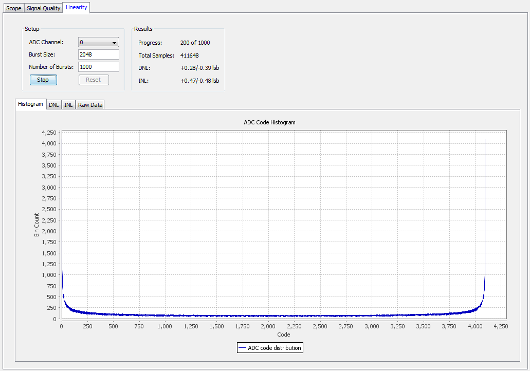
Histogram View
The Histogram view shows how often each code appears. The graph updates every few seconds as it collects data. You can use the Histogram view to quickly check if your test signal is set up appropriately.

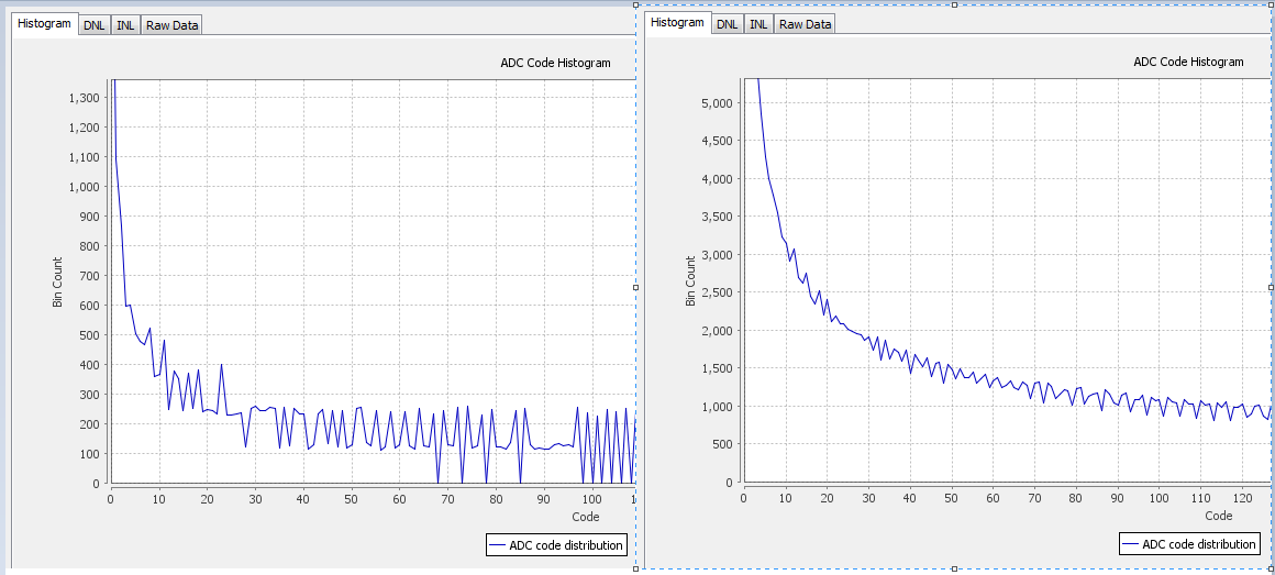
If your reference signal is not a relatively smooth line, but has jagged edges with some bins having a value of 0, and adjacent bins with a much higher value, then the test signal frequency is not adequate. Use Scope mode to help choose a good frequency for linearity testing.

Differential Non-linearity View
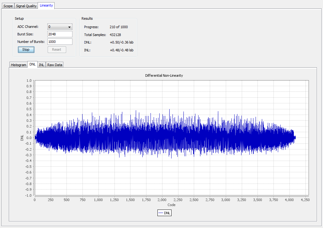
The DNL view shows the currently collected data. Ideally, you want your data to look like a straight line through the 0 on the x-axis. When there are not enough samples of data, the line appears rough. The line improves as more data is collected and averaged.
Each point in the graph represents how many LSB values a particular code differs from the ideal step size of 1 LSB. The Results box shows the highest positive and negative DNL values.

Integral Non-linearity View
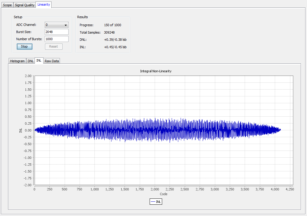
The INL view shows currently collected data. Ideally, with a perfect ADC and enough samples, the graph appears as a straight line through 0 on the x-axis.
Each point in the graph represents how many LSB values a particular code differs from its expected point in the voltage slope. The Results box shows the highest positive and negative INL values.
